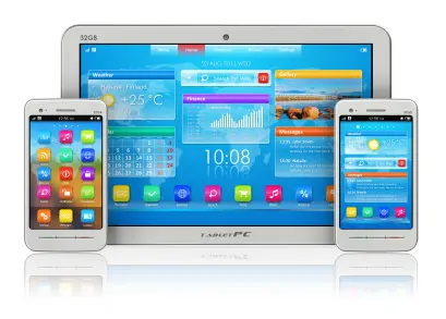
With sales of mobile devices increasing significantly over the years users have incorporated their mobile devices to search for information and buy things which has increased tremendously. 46% of Americans said that a mobile device is their primary way of accessing the Web and 2014. Ecommerce doubled from 2012 to 2013 with 2014 likely to continue. These figures show how important it is for businesses to consider which mobile solution work for them and more importantly their customers.
Whatever type of mobile solution you choose, there are great
services that bring great value to your mobile solution. Firstly you have the
ability find out where your users are and provide services that are relevant
according to their location. This is probably the most exciting added value for
your application, if it’s a native app or responsive website it can really help
you bring a great service to your customers. Others use the camera and the fact
at the end of the day you have a phone that can access information with touch
capabilities so you can make it easy to contact customer support.
Elastic and Responsive Website Design
This design incorporates programming that ensures that the data on a website remains in proportion. The programming allows websites to provide a level of usability irrelevant of what type of device is accessing the information.
The programming is relatively simple to enable the website to be responsive. It is an economical approach for businesses that have a rudimentary website for ecommerce or to promote their services. Html 5 has developed to accommodate a richer user experience, depreciating the need for a standalone mobile site or mobile app. Improvements in data storage, better hardware integration and offline capabilities has allowed responsive design to have offer an improved solution which is both economical with improved functionality. Responsive sites are part of the same entity as the site you would use on a PC. Google have defined access from a mobile device to impact of search results and page ranking for the website.
The disadvantages to this approach are quite significant.
While the technical ability may allow websites to function on the full range of
devices the usability and experience can be basic at best. Display problems can
occur where a file is stretched to be read on the device requiring excessive
amounts of strolling to read the whole article. The ergonomic
considerations can limit the effective display and how useful the website can
be to the end user. Websites arrangement of elements on the site may be
appropriate on a PC but there application onto a mobile device using responsive
design and programming may not be as successful. Application of the website
design to function on a mobile device does not guarantee a smooth navigation
experience throughout the website. The approach that is taken to upgrade the
website to meet the needs of responsive design can translate into a heavy
website and since its reliant of the hardware’s ability and internet errors can
occur when the device failed to download and display the content. Therefore websites may require being redesigned or elements removed to improve
the experience on a mobile device. Websites can require being rebuilt or
need to be built from the begging with mobile device application in mind. Since responsive design websites require the internet to function it can only
provide a limited service.
Mobile Websites
Mobile website can be used where a business is not looking to simply copy its website or wants a particular level of performance or user experience. By building a mobile site the business increases usability by further incorporating the technology that is on a mobile device.
A business may prefer to enjoy the results from a stronger mobile presence. The mobile site corrects a number of the unsatisfactory results found in a responsive design website. Since the phones technology is integrated in a better way back buttons and other website features would become unnecessary and you can use the navigating buttons on the device. The familiar touch screen tech gives a much smother performance. The improved ergonomics improves the general navigation and allows users to view and interact with information in an easier format and in a uncomplicated way. Filling forms and specifying certain choices are much easier actions on a mobile site.
With a mobile website a
common problem can be the URL management that provides the necessary routes
to users requesting the mobile from their mobile devices. Many websites do not
properly manage all the URL’s to all the levels that exist on the website. So
it can occur, when a request from a desktop can receive a mobile content or a
mobile request receiving desk top content. An example of this problem
transpires when mobile content is shared through social media and is accessed
through a PC. This poses a challenge to developers to ensure the potential for
improved navigation is fulfilled. Building a specific site requires a great
deal of time to analyze how buttons are used and options presented if the site
is to be successful. This can make the mobile option costly in a number of
areas .Mobile sites generally try to streamline the experience and a lot of
articles or documents found on a PC or a responsive site, might be
absent. The general consensus is that the best practices is that users want
access to all the information and appreciate the opportunities available to
them when they have all the information. Similar to responsive sites,
mobile sites are limited by needing to be connected to the internet.
Mobile Apps
Mobile Applications or native apps is the closest you will get to making the best use of functionality on a mobile device but developing an app for mobile devices comes with specific advantages and disadvantages.
The mobile apps have the luxury to have the data stored on the phone. This allows the user to receive and enjoy the service while there is no internet reception. This is an important advantage over the previous solutions. The mobile apps effectively integrate the central capabilities found on the devices allowing seamless integration between the phone video and music capabilities, GPS, camera and imaging tools all can be built in as part of the app itself. Many apps start with which tools they want to be part of the building blocks of the app. The user experience can be developed to meet the needs of the user directly. Data can be collected about how the users are using the app allowing developers to improve the experience and increase reliance and value of the app to the end user. Through periodically synchronizing the app, information and content can be delivered to the user when they set up a connection. This can place the choice to receive update content with the user. Mobile apps have an opportunity to fit into a number of advertising revenue streams. Small banners and relevant promotion can generate additional funds for the business and brand. Impressive statistics are published quarterly on the mobile market fueling marketing and advertising revenue in mobile solutions to promote products and services.
There are disadvantages and issues with mobile apps. Since there is a number of apps the average person uses a day and is happy to store on a phone, mobile apps are in a constant competition. The disadvantage of spending the large price tag for an app and there is a possibility that no one will use it. An app that is closely linked to a brand will be more successful, making sure that people are connecting to the brand will improve the apps success. Another disadvantage is that one app is just not enough. Building an app that works well on an iPhone may not work the same way on an android phone. The cross platform apps can be tricky. You ultimately pay big bucks for an app that does not work well on either phone. You might be forced to choose which app you want to start with and eventually add on an app that will work on the other operating system.
Hybrid solutions are an interesting development matching a small mobile device app with a mobile website that works alongside the app. Walgreens and banana republic are two good examples of this solution. The app provides a level of service with information and activity updates. When you want to access anything available through the app it will send you to the stand alone mobile site to continue to service your request. The advantages are that a minimum amount of time is required to set up the app for different platforms and you can then develop a website that will work well on different mobile devices. The hybrid is interesting because it positions a business in the app stores for both android and iPhone. People can discover the brands in the store use the app and discover the mobile site for information and ordering products. If you want an app, hybrid solutions will unlikely meet your requirements.
Side by side responsive design, on the face of it, can be too basic to supply a suitable service to your customer but a redeeming factor is that Google stands by responsive design and says a lot about the future of mobile sites. As html increases to improve and sites are designs with responsive uses in mind, responsive sites will be more effective on mobile systems. A mobile site gives improved usability and allows you to then create a small app to support the mobile site. That may be a wonderful approach to see the possibility to eventually have a mobile app. To start with a mobile app from the get go can provide an amazing user experience but can be too costly and unnecessary unless you have the brand and customers to support the apps’ development.


